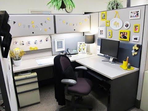
Designing with purpose

What does designing with purpose mean? To take a seat and evaluate factors such as your business, what it represents and the kind of clients you already have and the ones you strive to attract. Your work place is not your home but your employees and you spend more time in the office than home, so it makes sense to design with a purpose. Irrespective of the size of your office or your budget, there are a few questions that you need to ask yourself to get cracking on:
What is my brand message? What story do my clients want to hear? Bold, bright or subtle colours? Modern, contemporary, classic or chic? What are my clients like? These are some of the few questions that you should ask yourself before starting out.
- Be clear on what your office says to others.
If you are a interior designing company and your office looks like a doctor’s office, then there is something off. Before you begin designing your office, pick out ideas from blogs and magazines that you like doing this helps your own research and also helps making informed decisions regarding décor.
- How does it or will it translate into design?
For example: Mahogany everything at a law firm does not translate to trust and reliability always. You could try copper, brass and marble.
Don’t try sticking too much to clichés just because “that other office” was featured in a magazine
. Be true to your company and think outside of the box so that the design is genuine and represents the owners of the business.
- Colors and how you use them.
A great way to add dashes of colour to your office is by incorporating accent items such as vases, desk accessories, lamps and rugs, this is convenient if you don’t want to commit to things like a painting.
Throw pillows are also gaining popularity, a nice and comfortable touch to your workspace.
- Artwork also speaks of your brand.
Just because the last tenant left it and it fits in the spot doesn’t makes it right for your brand. Use step one to enhance step four.
Just because your office was left spick and span by the previous tenant does not make the design right for your business.
- Photos, certificates and awards.
It is a good idea to space our photos at your office in every room. Do not overcrowd the reception with random pieces of art or pictures, it is advisable to put up recognizable faces of your team or artwork which reflects your brand’s image.
Adding certificates to your waiting area is also a good idea because it expresses the credibility of your business, but be sure to not add too many awards and certificates in the same area as that might give off a flashy vibe, spread your awards and certificates throughout the office in different rooms.
- Photo and award showrooms.
If you have the space and want to make several showrooms special how about calling each showroom what it is. Photo showroom is filled with fun photos whether it is of your staff, clients or events the company have created or attended.
me for the certificates showroom, keep in mind do not hang them all in one line select different size frames as well as colors (select a color scheme and work with that)
Award showroom, pending on the space use standing slim shelving to feature the awards and then add floating shelves on the wall of various sizes. Using floating shelves in various sizes will give a modern feel to the showroom without feeling overcrowded.
If your showroom does not have a modern feel you can still use floating selves in various sizes just stagger them down the wall so the awards aren’t cramped on a shelf.
- I want my office in the press.
To have your work space featured in a magazine you would have to have a bunch of cook things that capture ones attention. These items cannot be random items, they need to tell a story about your business and the work that your company provides. Not every business has the privilege of having showrooms on every floor, if this is the case with your business then I suggest you have ‘creative room/motivational room’ or whatever you call it in your industry. Design the room so that it stands out but still works with your branded story.
- Don’t forget the break room/lunch room.
I know it’s just the break room, or a kitchenette but it should still be designed. I walk into so many well-designed spaces and pass the open kitchenette area and it’s just there, no color, no style no nothing.
The break room needs to have its own personality as well. Select a color and use it in the stools, chairs and table. The containers holding items should match and the appliances should also match.
I’ve given you eight easy steps to design and brand your office space to make it uniquely yours. I would love to hear how you have designed your space outside of your home office. Ready, set, design!
Collected and published by PropertyePortal editorial team. Get in touch with us at [email protected]